
Analysis
Symbolism and statements
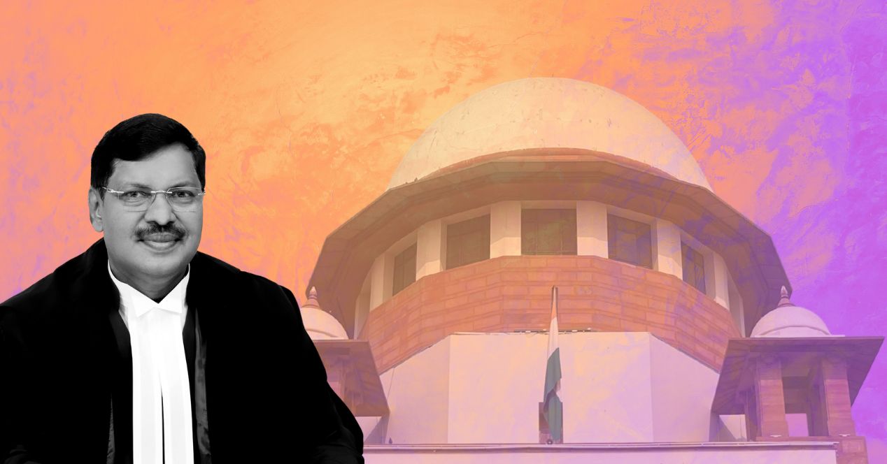
Reversing two administrative moves of the Chandrachud term, CJI Gavai recently remarked that the Court is returning to its ‘original avatar'
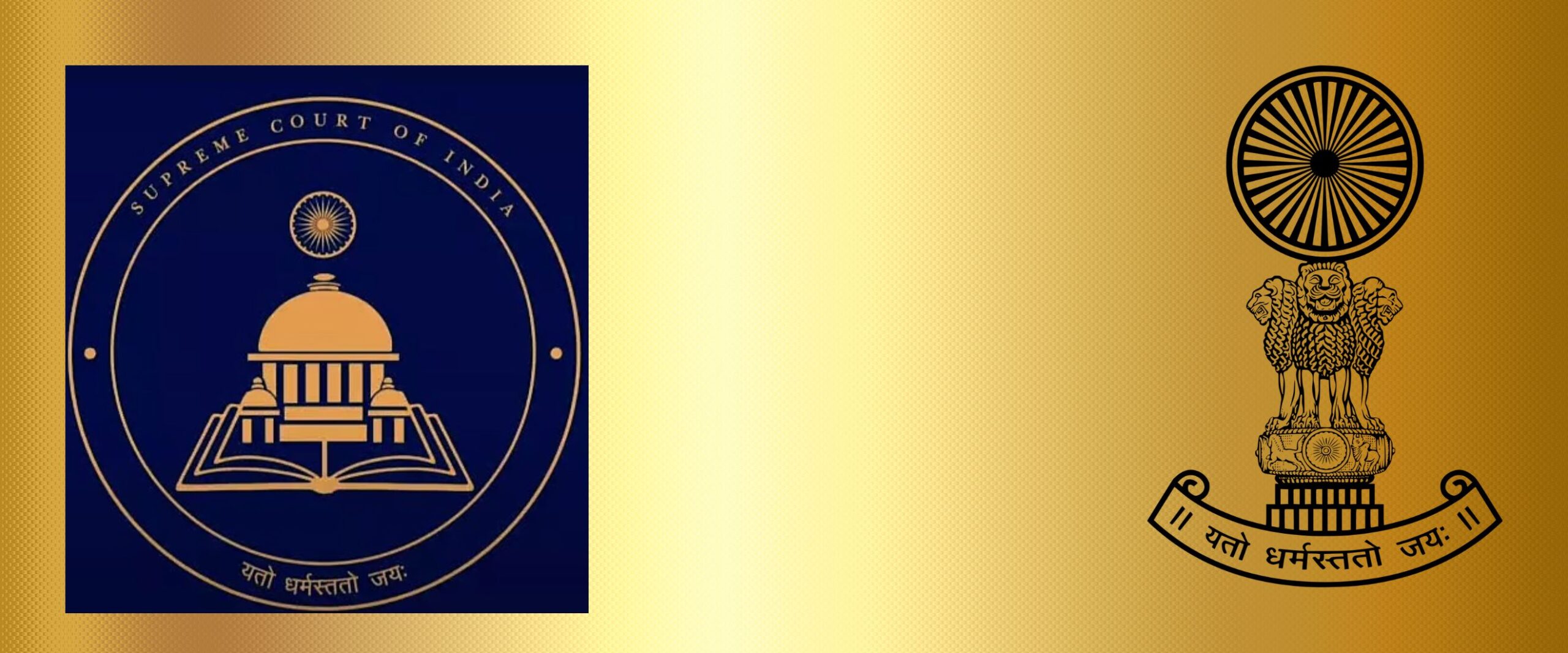
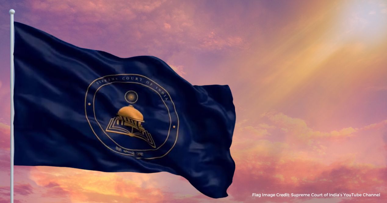
Last week, the Supreme Court reinstated its old logo, which has the state emblem of India—a version of Ashoka’s Sarnath lions—as its centrepiece.
In September 2024, with much fanfare and as part of the Court’s 75th anniversary celebrations, the new logo was unveiled by then Chief Justice D.Y. Chandrachud and President Droupadi Murmu. Designed by the National Institute of Fashion Technology, the seal featured a navy blue background with a golden line-drawing of the Court’s iconic rotunda emerging from an open Constitution. The building was crowned by the Ashoka Chakra. This graphic was framed by a circle.
There is much to say about the iconography that replaced the Sarnath lions in the new design. Courtroom Number 1, where the Chief Justice of India traditionally presides, is directly under the central dome designed by G.B. Deolalikar. Legal historian Rahela Khorakiwala has noted that the dome signifies a “sense of order amidst the diversity of people it represents.”
But there was much that remained unexplained. The choice of navy blue, for instance. At the time of the launch, we speculated that it echoed two symbols of Buddhist inspiration: the Ambedkarite flag or the Ashoka Chakra. In any case, the symbolism was potent and the overall design, with its colour and clean lines and circles, suggested the embrace of a burnished, contemporary identity.
In returning to the monochromatic seal with its etched Lion Capital, the Court under CJI B.R. Gavai seems to have taken a step back from the modernist sensibility, at least from a graphic design point of view. This rollback was accompanied by the reversal of another modernist intervention of the Chandrachud Court—the glass partitions in the Court’s corridors.
The former CJI had them installed to better contain the air-conditioning during Delhi’s brutal summers and to keep out the bone-chilling draughts of biting winters. But several lawyers had complained that the glass partition was disruptive and antithetical to the building’s flow and openness. By directing its removal, Justice Gavai appears to be returning to the ‘roots’ of the Supreme Court in one more way.
We’re wary of reading too much into cosmetic changes. But considering that administrative decisions contribute some shape to the eventual legacies of Chief Justices, it’s tempting to wonder about what it all means. Are these reversals indicative of a broader shift favouring continuity and rootedness over reinvention and experimentation?
Some of my colleagues see it as a power move, a quiet assertion of authority by the new CJI. Others cautioned not to read too much into it, pointing out that the 2024 logo was meant to commemorate 75 years of the Court and the Constitution and was not intended to be permanent. A third possibility is that this is simply a return to a symbol more widely recognised by the public. There’s also the personality-centric aspect of institutional reforms to consider. (Justice Oka recently remarked that the Court “cannot be CJI-centric” and emphasised the need for restraint in how the judiciary represents itself.)
Political theorist Max Lerner has argued that courts survive through the legitimacy they derive in the “psychological realm”. CJI Chandrachud’s redesign seemed to imagine a Court that draws legitimacy from a modern, accessible constitutionalism. CJI Gavai’s early administrative decisions and utterances may suggest that the Court’s authority is grounded in its austere roots.
In the grand scheme of institutional continuity, symbols and refits may count for much less than listing shake-ups and landmark judgements. For now, the Court’s logo is cloaked in monochrome once again. Future observers may decide whether the reversal was radical, reactionary or simply reflective.
This article was first featured in SCO’s Weekly newsletter. Sign up now!
Related articles
Analysis
B.R. Gavai, the first Buddhist and second Dalit Chief Justice of India
The new CJI has a reputation of having a sound grounding in the law and Constitution. What are the opportunities and challenges he faces?
Analysis
Waving flag
A quick look at the value of judicial symbolism in the backdrop of the Supreme Court’s recent unveiling of a new flag and insignia
75 Years of SC Articles
Justice In Circles
How architecture, history, and tradition inform the duality of Indian courts
Analysis
The end of the Chandrachud era
Analysing the tenure of the longest-serving Chief Justice since 2012 doesn’t lend itself to easy generalisations and pithy one-liners